Silent Signals: What Your Visual Branding Says Before You Speak
You’re already thinking about what to post, when to post, and how often. But here’s a question most agents overlook: What does your brand look like—and what is it saying before you even write a caption?
Your visuals are doing a lot of talking, even when you’re silent. Fonts, colors, and imagery work together to send subconscious cues about who you are, what kind of clients you serve, and how polished your process is. And if those signals don’t align with your actual brand, you're leaving opportunity (and trust) on the table.
Here’s how to make sure your visuals are saying what you want them to.
1. Fonts Signal Personality (and Professionalism)
Typography is often overlooked, but it sets the entire tone. Think about the difference between these:
-
Serif fonts (like Playfair Display or Georgia) give off a feeling of heritage, tradition, and high-end service.
-
Sans-serif fonts (like Helvetica or Poppins) feel modern, clean, and approachable.
-
Handwritten or script fonts convey a sense of personal touch—great for lifestyle content or boutique branding, but risky for listings or market data where clarity is key.
Pro tip: Use one font for headlines and one for body text. Consistency is more important than complexity.
2. Color Isn’t Just Aesthetic—It’s Strategy
Colors evoke emotion, and when used intentionally, they can reinforce the type of experience you offer clients:
-
Blues and grays feel trustworthy and stable (think: professionals who specialize in relocations or investment properties).
-
Greens and earth tones feel grounded and organic—great for agents focused on sustainability, wellness, or suburban buyers.
-
Black and white palettes with a pop of color (like gold or rust) can signal luxury and exclusivity.
-
Brights and pastels are playful and youthful, often a fit for agents working with first-time buyers or creative communities.
Ask yourself: Does this palette reflect how I want my clients to feel when they interact with me?
3. Photography Should Mirror Your Audience
The imagery you post should reflect both your market and your mindset. If your feed is filled with generic interiors pulled from Pinterest, it’s hard for clients to connect with your listings—or your story.
-
Lifestyle photos of your neighborhood or favorite coffee shop say I live here. I know the area.
-
Client photos (with permission) show real trust and satisfaction.
-
Personal snapshots sprinkled in (think: your desk, your car, a candid showing moment) remind people there’s a human behind the brand.
Visual trust is built through authenticity and alignment. Don't just post what’s trending—post what’s true to your brand.
Mini Case Studies: What Visual Branding Can Say
The Refined Relocator
An agent who works with corporate clients moving to major metro areas uses modern tones, minimal typography, and high-contrast architectural photography. Her brand says: efficient, high-touch, no-frills luxury.
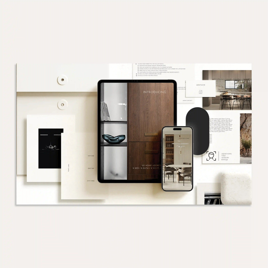
Interested in this style? Check out our Branded Templates in the style GRAPHITE. This brand style exudes an air of minimal elegance, influenced by the allure of modern type and crisp bold lines
The Warm Neighborhood Specialist
This agent leans into bright colors, serif fonts, and lifestyle photos of schoolyards, parks, and weekend markets. Her brand says: local, approachable, family-first.
Interested in this style? Check out our Branded Templates in the style POPPY. This brand style is an enchanting blend of playful and modern, radiating personality with pastel tones alongside bold pops of color.
The Trend-Savvy Real Estate Guide
Bright neon blues and greens, bold sans-serif headlines, Reels with “get ready with me” vibes—his visuals say: modern, relatable, and ready to make real estate less scary.
Interested in this style? Check out our Branded Templates in the style ONYX. The brand style is for the tech-savvy, modern mind, employing bright, fluorescent colors to communicate energy and ambition.
Why It Matters
Clients decide how they feel about you before they even send a DM. And in a digital-first world, your visuals are often the first (and only) impression. Are they saying what you want them to?
You don’t need to overhaul your whole identity—but you do need to be consistent, intentional, and self-aware. Silent signals matter. And when your visuals align with your values, you earn trust faster.
Want help getting your brand visuals in sync?
Inside The Brand Source subscription, you’ll find templates that are professionally designed to help you maintain visual consistency without the guesswork. Pick a design direction that fits your vibe—and stay on brand with every post, email, and listing.